
How I Create a Bespoke Gouache Palette
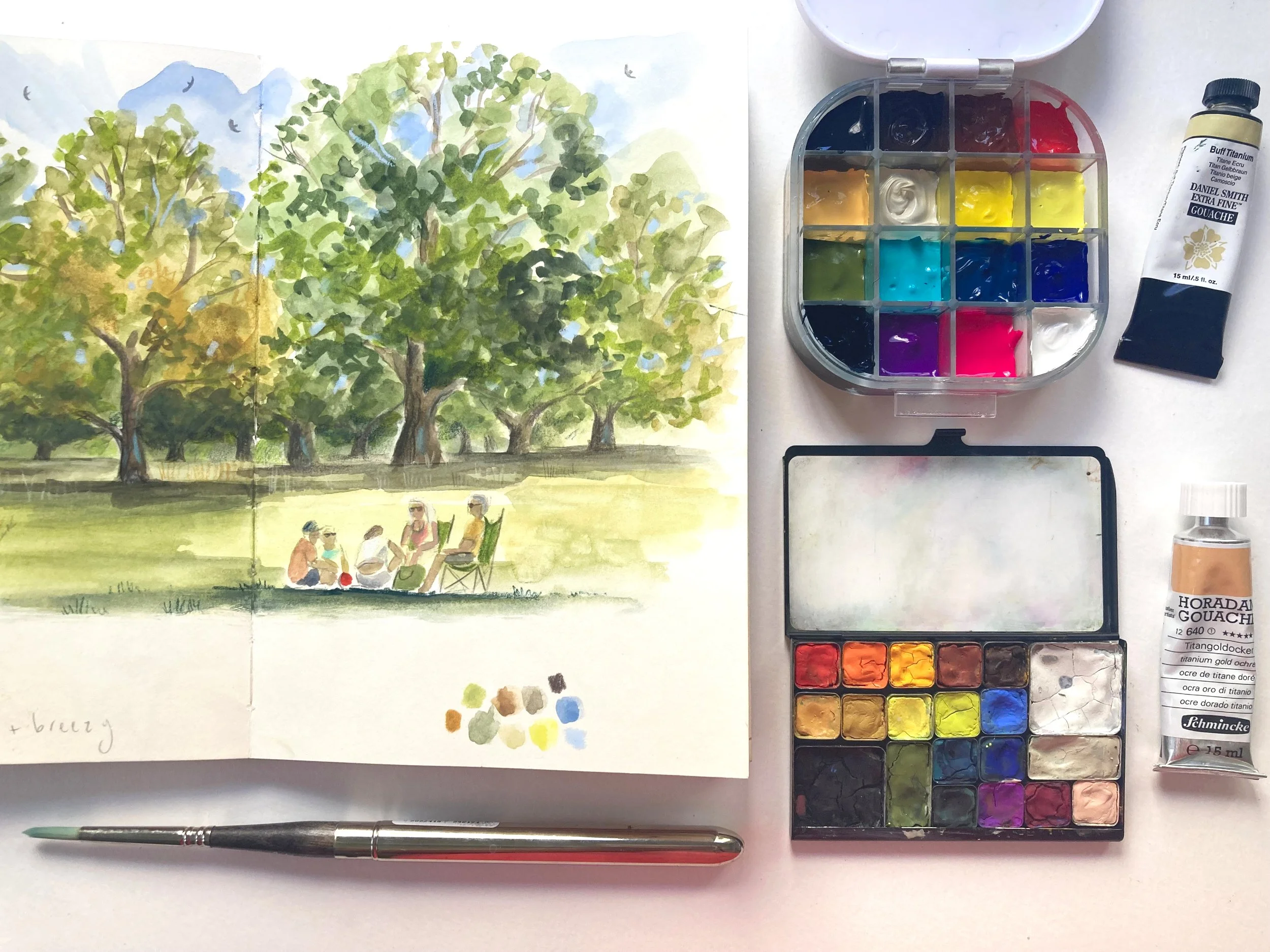
For a few years now, I’ve enjoyed creating my own bespoke paint palettes. In the past, I’ve bought sets from brands I liked but always noticed that there were a handful of colours that I rarely, or never, used. This isn’t to say that pre-made sets are no good, they’re an excellent investment, especially if you’re just starting out on your painting journey.
Making your own paint palettes though, means that you can curate beautiful collections of colour that you’ll love using, and also tailor them to suit exactly what you enjoy painting the most. A landscape palette, for example, will be quite different from a palette that’s specifically for portraits.
I first started to create my own palettes a few years ago, filling empty paint tins with watercolour pans. Creating palettes is slightly addictive, so be warned! You can purchase empty tins and pans very easily, and decant the paint directly from the tube. If you’re making a watercolour palette, most brands sell half and full pans of paint which is a more convenient way of curating a bespoke palette.
A year or so ago, I decided to create a gouache palette. At first I was dubious - I know that gouache paint can crack or crumble when it dries and I wasn’t too sure how well it would turn out! I’ve created two really nice sets and despite some cracking (some colours are worse than others), I have managed to maintain them really well without them totally disintegrating or becoming un-useable.
I have used two different kinds of palettes for my gouache paint. The first one is the Art Toolkit palette here - the paint in this one does dry out completely and I use it more like you would a watercolour palette, whereby I have to reactivate the paint with water to be able to use it. It’s perfect for travelling with though, because it’s very light and the paint is dry - zero mess.
The other palette (shown in my pictures on this post) is an airtight one which I bought here. This one is brilliant, each pan is completely sealed by a protective rubber layer inside the lid, meaning that the paint stays moist for way longer. It’s also very portable, no matter how much this gets thrown about in my rucksack, the colours stay sealed in their individual pans.
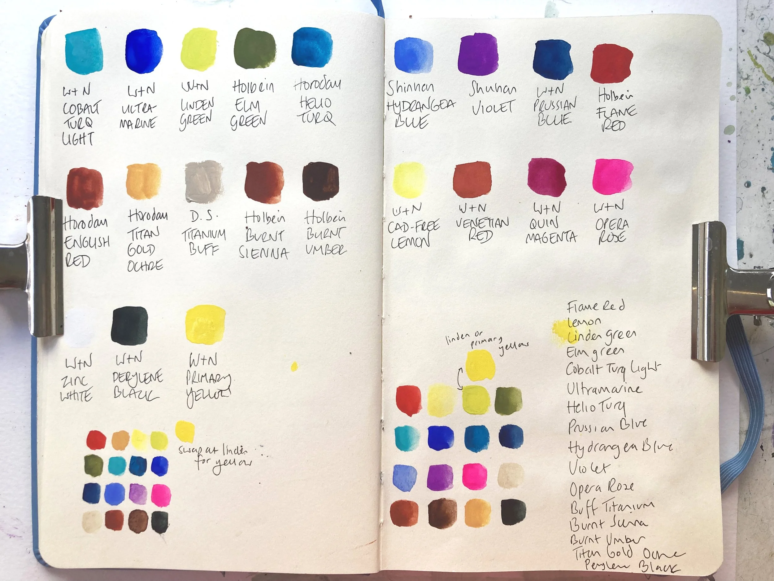
Royal Talens Art Creation sketchbook - I use one of these for all my colour recipes, colour mixing, and swatching - it’s a great resource!
The soft chalky finish of gouache paint makes it one of my favourite mediums to work with. I’ve just cleared out an old airtight palette to make a new gouache paint collection, and I thought it might be helpful to share the process here with you in case you’d like to make your own.
CHOOSING YOUR PAINT
First of all, I lay all my gouache paint tubes out on my desk and randomly select the colours that I’m drawn to. I’m thinking about my favourite colours that I use all the time, and the kind of work I’ll be doing (and usually that involves landscapes), so I’ll be choosing colours that are inspired by my surroundings, or the season - sometimes both.
I do swatches from each tube I’ve chosen, and label them (see above). I then have to whittle down my selection to 16 (which is the number of spaces in this particular palette).
COLOUR MIXING EXPERIMENTS
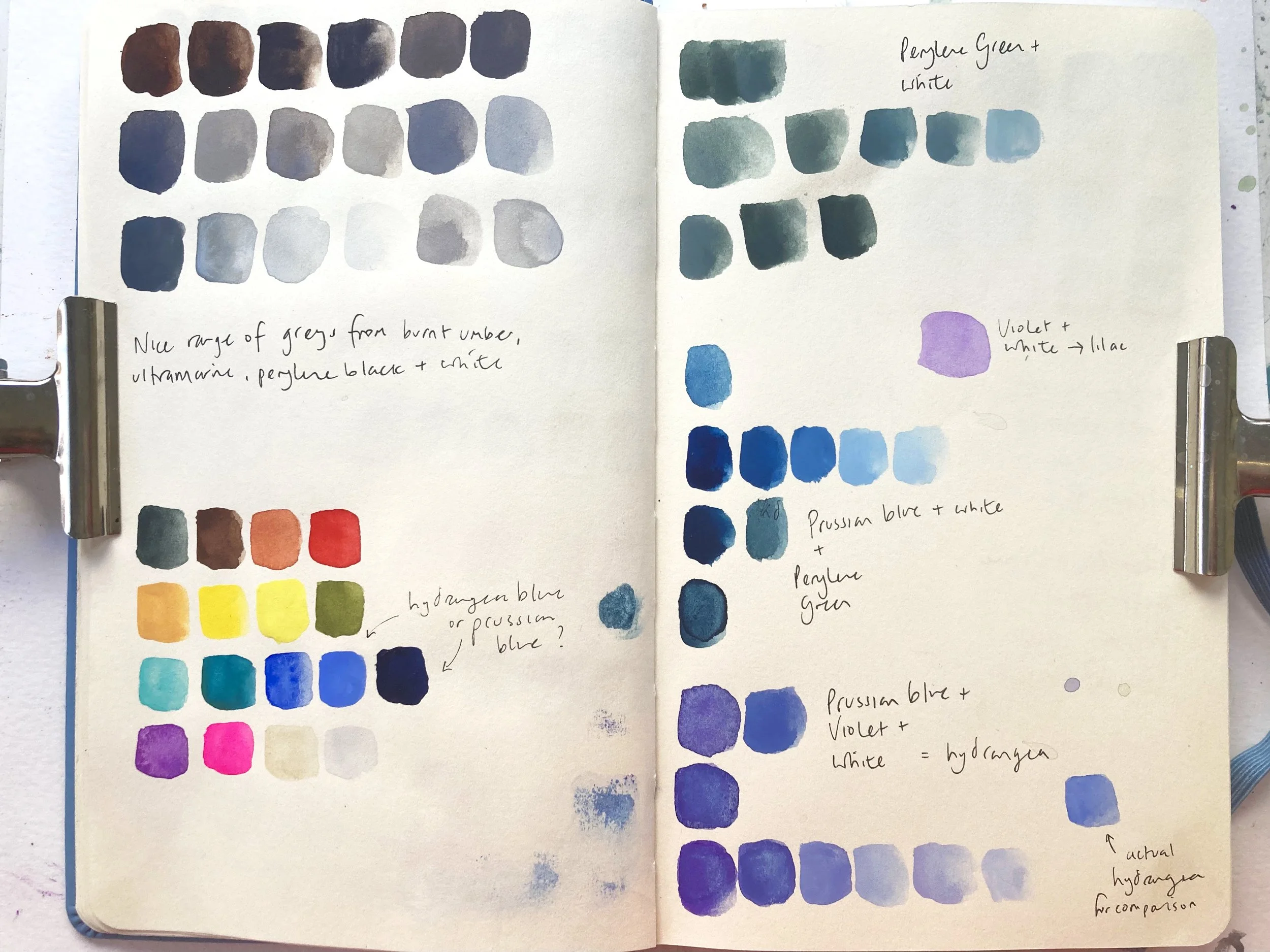
It’s tempting to just go ahead and choose a bunch of colours that you like, and of course that’s totally fine if you want to do that. But I also like to base my selection on how useful a colour is, and how many colours I can mix with it.
As I created my colour swatches, I noticed that the Linden Green and Lemon Yellow were actually very similar to one another, and I then discovered that I could make a very close copy of Linden Green when I mixed Primary Yellow with Helio Turquoise.
Lemon Yellow was going to be a more useful colour to me compared to Linden Green, in that it would give me many more mixing opportunities. Again, this is all an exercise in deciding which colour is going to add the most value to your palette, and finding out how versatile it is.
If you only have a tiny palette with room for six colours, then I’d recommend an Ultramarine Blue, a Primary Red and a Primary or Cadmium Free Yellow, along with a white (Zinc for example), and a black (Lamp Black) or Paynes Gray. You’ll be able to make no end of great colours with just these paint colours.
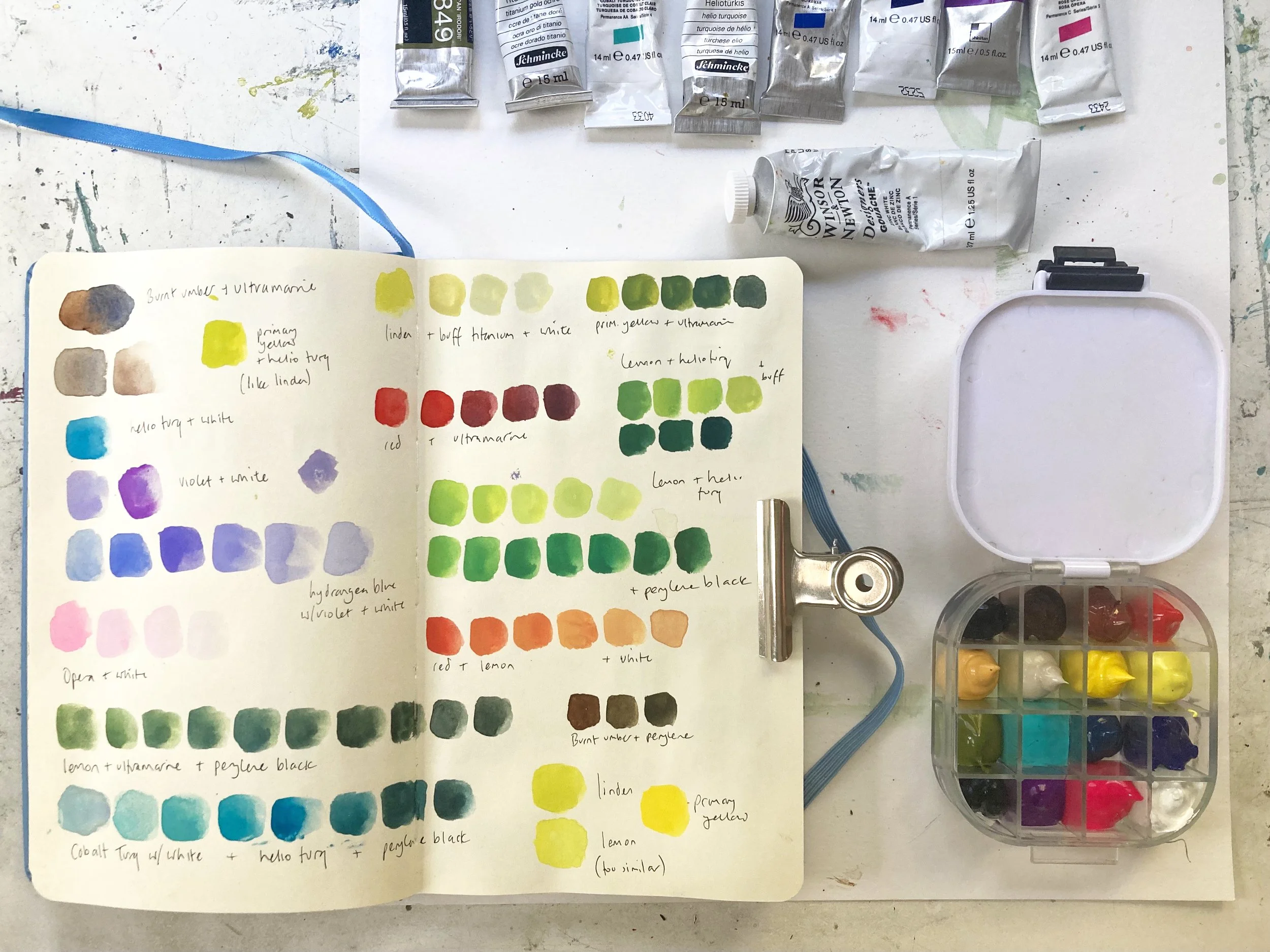
I really love having a few different blues in my palette! Being a primary colour they’re great for mixing to create so many other colours and having at least two or three different ones guarantees that I can create a very wide spectrum of colours.
A blue that I chose to leave out (and which is one I really like) was Hydrangea, which is delicious shade of lavender blue. I didn’t have enough space in the palette for both this colour and the Prussian Blue, and after playing around with some colour mixing, I decided that Prussian Blue would be far more useful to me alongside my other primary colours, and could also be mixed with a little violet and white to create a very similar version of Hydrangea which I was more than happy with!
Prussian Blue also mixes with both Lemon and Primary Yellow in this palette to create some beautiful shades of green - essential when you’re painting trees and landscapes.
It took me a couple of hours to figure out exactly which paints would be going in the new palette, but as a result I know I’ve got a palette that will serve me well when I’m painting en plein air, and will help me create all the colours I want and need.
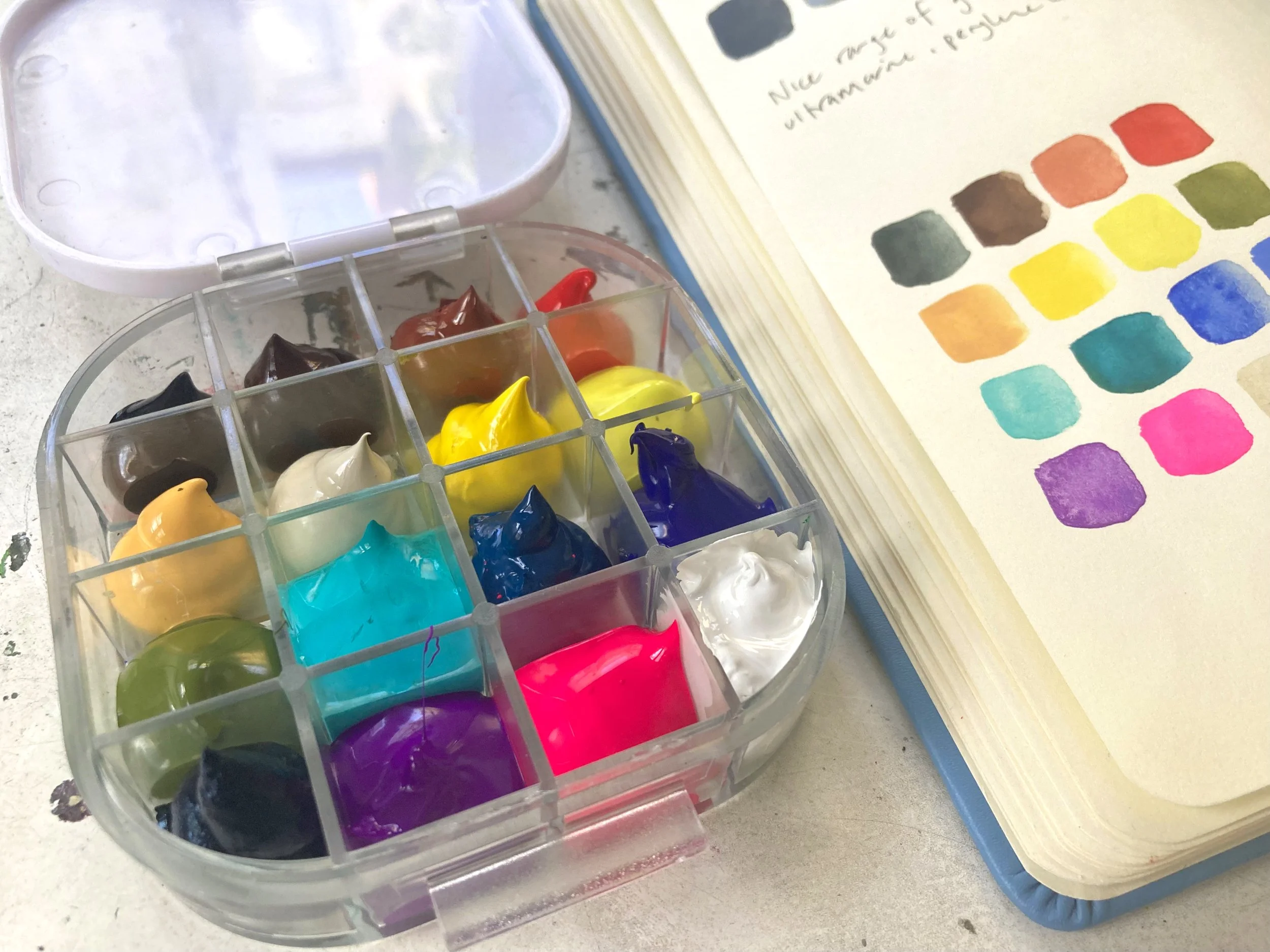
The airtight palette is perfect for keeping gouache moist for longer, and is perfect for taking out with you as there’s no spillages.
ADDING GOUACHE TO YOUR PALETTE
First of all, make sure your palette is clean and dry. You’re going to need some kitchen towel and some cocktail sticks too.
Choose the layout of your colours - it’s really helpful to lay your colours out in colour order so that you’re not constantly looking for the colour you want - keep the reds and browns together, and the greens by the blues and so on.
Squeeze the gouache into the pan, and aim to fill it about half way. Take a cocktail stick and gently move the paint around so that it goes into all the corners and you get rid of any air pockets. Use damp kitchen towel to wipe away any smears or spillages as you go.
Carry on adding the paint until your palette is full. When your gouache has dried out (if you’re using a normal tin type palette or the Toolkit one), you’ll notice that the paint sinks a bit in the pan - this is totally normal and nothing to worry about. You might also notice some cracks appearing. I tend to go around again and refill afterwards, pushing the paint into the cracks and filling the pans to about 3/4 full.
TIP * If you have a colour that dries out particularly badly and starts to crumble (my personal experience has shown that Cobalt Blue and Quinacridone Magenta are usually the ones to do this), you can add a tiny drop of gum arabic to the paint when you squeeze it from the tube. If you add too much, you’ll notice a glossy sheen to your paint when it dries, and it also means it will lose some of its opacity. Just be sure to stir it thoroughly, and it should prevent extreme cracking or crumbling.
Make yourself a small colour swatch guide to keep with your palette so that you know at a glance what colours you have and where they are. This is especially useful for darker paint colours which have a tendency to all look very similar once they’re in a paint palette and not in a labelled tube. I like to stick mine on the lid with glue dots so it’s with me all the time, and I can easily change it when I make a new palette later on.
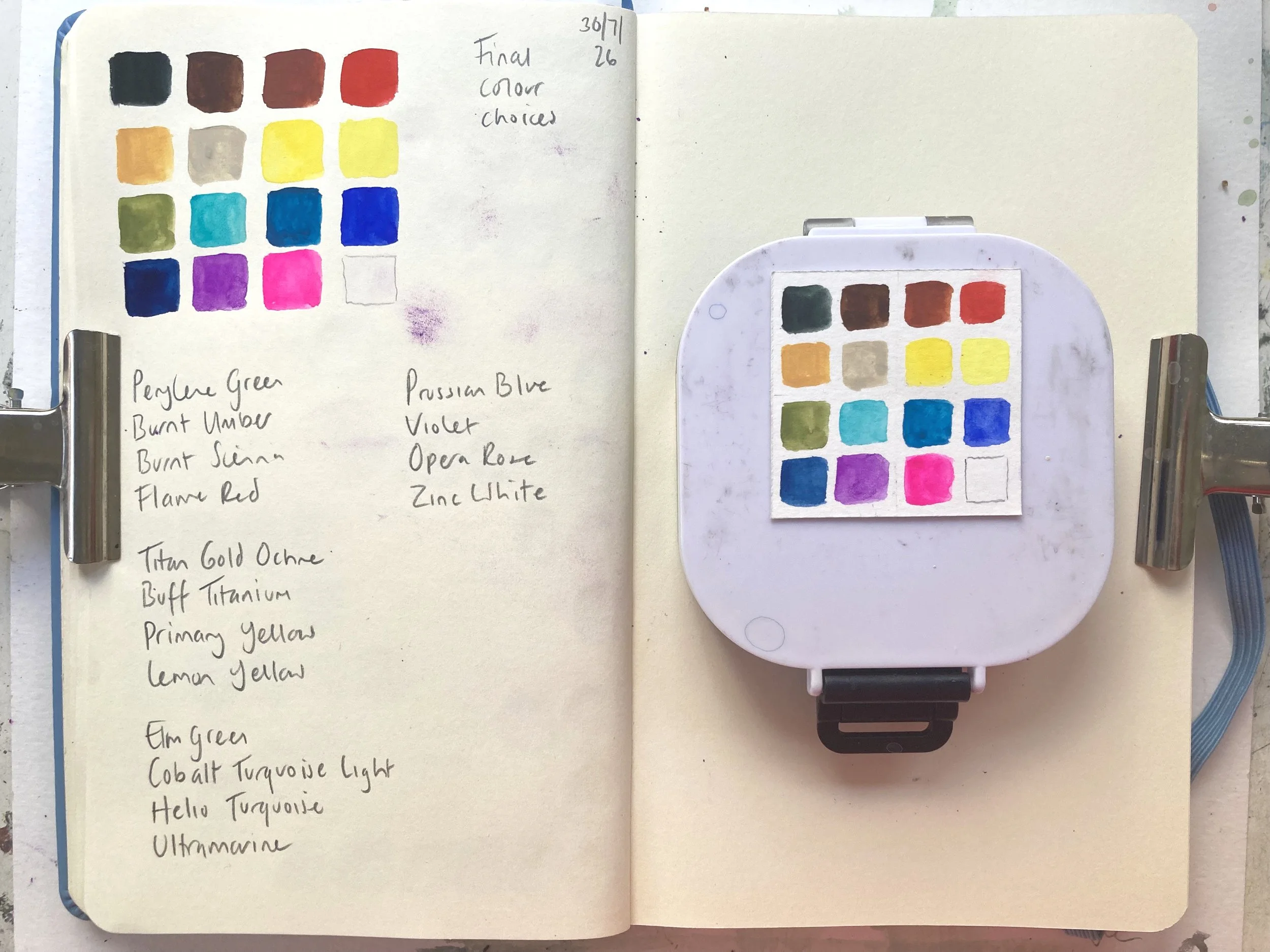
My Gouache Colour Palette
If you’d like to use the colours I chose to create a gouache palette, you can find the colour names and brand names of each one below.
Perylene Green. (WN)
Burnt Umber. (HB)
Burnt Sienna. (HB)
Flame Red. (HB)
Titan Gold Ochre. (SH)
Buff Titanium. (DS)
Primary Yellow. (WN)
Lemon Yellow. (WN)
Elm Green. (HB)
Cobalt Turquoise Light. (WN)
Helio Turquoise. (SH)
Ultramarine Blue. (WN)
Prussian Blue. (WN)
Violet. (S)
Opera Rose. (WN)
Zinc White. (WN)
Brand Key:
WN = Winsor & Newton
SH = Schmincke Horadam
HB = Holbein
S = Shinhan
I hope you found this helpful, if you’ve got any questions about gouache paint or making palettes, please get in touch I’d love to hear from you!